Gradation
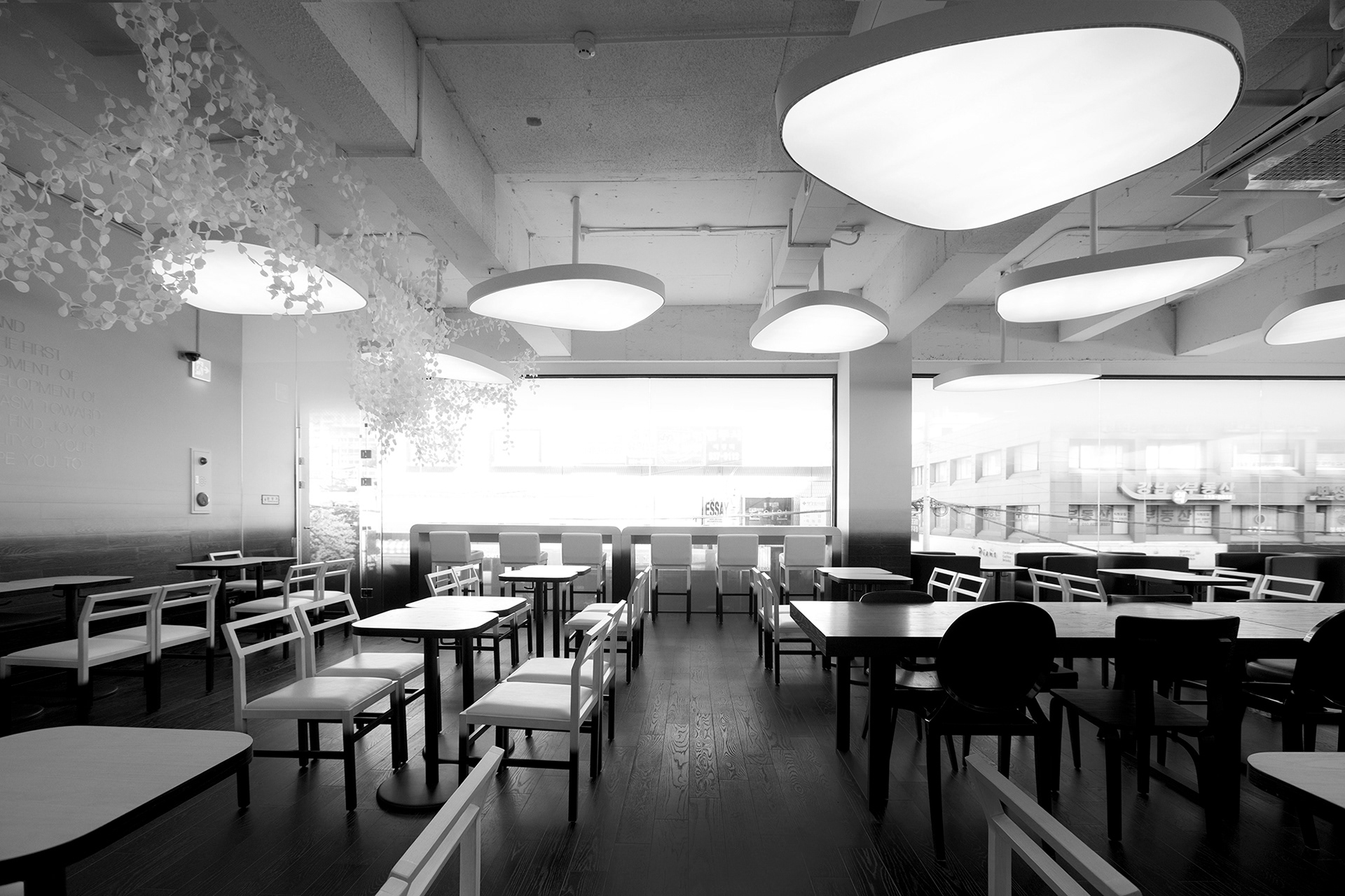
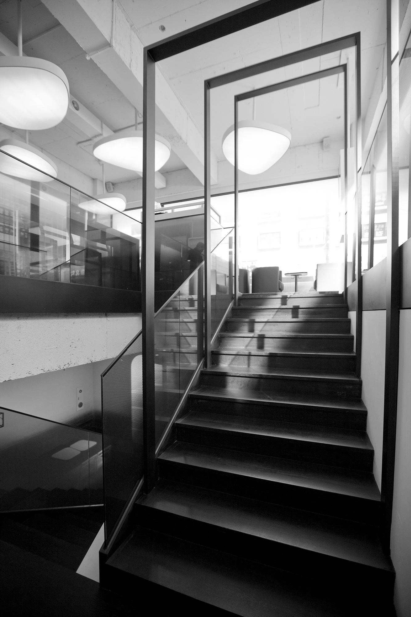
EVERAYDAY CHAA was attempted to be expressed as a quiet space that could give an emotional resonance without any change in its shape or particular details. The calm and plain direction like the lake under the moonlight fringed by the dense fog is continued up to the whole space and furniture. This aims to give the comfort to people’s eyes in a horizontal space as a metaphor from nature. Changes in texture from floor to ceiling are dominantly used in EVERYDAY CHAA. This gradation is applied to not only the space but also the whole brand identity of EVERYDAY CHAA beyond the space to be shown in many different applications including the brand logo.
View of the second floor
View of the second floor


The floor finished with wood is connected along the wall to blur boundaries. This meets the ceiling and the wall finished with painting to become an all-encompassing design. There is no partition fixed to be an open space without borders on the second floor, a main space of EVERYDAY CHAA. The lighting as a motif of nature and partitions splendidly coming down from the ceiling are key elements of this space. Other decorations and shapes are minimised not to disturb the aura that surrounds the space.
View of the first floor
Details of leaf-partition and lighting
The space close to our culture is presented through tea, not coffee. It is hoped that EVERYDAY CHAA can be the right place in drinking teas in Seoul in a state that services are saturated.